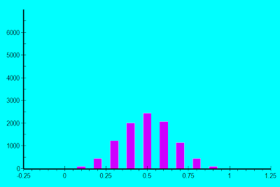
Bell curves arise when we add up multiple independent random variables. Instead of working through a hairy mathematical proof, let's do some simple experiments to demonstrate the idea. Consider the following simple game: Flip four quarters at the same time; add up the value of all those which come up heads; that's your score. Multiply by $100,000 and that's your annual family income. Think of this as a very primitive competitor to Milton Bradley's Life game.
Now consider many people playing this game. If we record their scores we get a wealth distribution. You can generate such a wealth distribution at home. Just get a sheet of 1/4 inch graph paper and write the possible values ($.0, $.25, $.50, $.75, $1.00) in a row. Then flip the quarters again and again. After each flip fill in a square above the number corresponding to the score. With around 100 flips you should see something like this:

By the way, I cheated. I didn't actually flip physical coins. I wrote a C# program to flip virtual coins using a random number generator and then plot the results. I had a good reason: the next experiments are more complicated and involve more flips. A physical flipping session would take too much time. (As it was, writing the C# code took some time, since I am a C++ programmer by day. I used this exercise as an excuse to play with C#, and that's one reason why it took me so long to get this post up.)
Your results -- if you did your homework -- should similar but not identical to mine. I can say this with confidence even though I don't have your quarters. Yes, you could have a distribution where most of the flips are $.00 or $1.00, but this is very unlikely. There is only one way to score $.00: TTTT. There is only one way to score $1.00: HHHH. Meanwhile, there are four ways to score $.25: HTTT, THTT, TTHT, and TTTH. Similarly, there are four ways to score $.75: THHH, HTHH, HHTH, and HHHT. Finally, there are six ways to score $.50: HHTT, HTHT, HTTH, THHT, THTH, and TTHH.
This is a general principle. With multiple independent random variables you get more possible flips/rolls. And as we increase the number of independent random variables, we get a smoother bell shaped curve. For example, let's replace the four quarters with 10 dimes:

Or replace the four quarters with 20 nickels:

Note that I went up to 1000 rolls in order to get a good statistical sampling. With the computer doing the rolling for me, why not? Diligent readers can perform these experiments with graph paper and watch the distribution evolve.
No rule says that all the random variables have to be the same size, nor do they all have to be binary. We could replace one quarter with 5 nickels, two quarters with 5 dimes and one quarter (approximately) with two 12 sided dice. The result:

Note how the hump narrows as we use smaller coin denominations. To map these experiments with the national income distribution, we'll need to scale by standard deviation and shift to match median values. Our four quarter experiment so rescaled gives us:

Our 20 nickel experiment gives us:

By now many of you are thinking, "So what? What do all these coin flips and dice rolls have to do with the super rich?" The answer: let's consider each of the original quarters as a factor which leads to income. Let one quarter represent intelligence. Let another represent health. Let the third represent ambition and the fourth represent startup capital; that is, family wealth or connections which come from growing up in the right neighborhood. Our first experiment crudely models these four factors as "you either have it or you don't." The 20 nickel experiment can be thought of as replacing each quarter by 5 nickels, giving us a rough bell distribution for each factor. We could get smoother yet by replacing each quarter with 25 pennies, as below:

But even this 100 penny experiment gives us a mere $425,000/year maximum income when scaled to the census figures -- and no one got that much even after 100,000 rolls! With 100,000 rolls the highest income was $215,000/year and I only rolled that once (which scales to 1160 people having that income). Where are the Bill Gateses and Sam Waltons? We could stretch our distribution further by using more coins/dice. Income is a function of more than four factors. For example Bill Gates is intelligent, from a well-off family, very interested in computers (vs. yoga, philosophy, or politics), very interested in business and making money (unlike his early competitors), had access to computer time back when it was very expensive (thus getting in on the ground floor of an industry), and perhaps a bit lucky. Yet even with more factors the factors still don't add up to give us Bill Gates income.
But should we be adding? Does computer skill = intelligence plus interest plus access to computers? Maybe we should be multiplying some of these factors! We'll look at some experiments with multiplied random variables in the next post, and then meditate on the consequences.


